THIS WAS TOO STRESSFUL. Okay, so I found a tutorial I thought would be nice, only to find out thirty minutes into class that it was for photoshop. Freaaaaking Photoshop. I used my pre-made ornaments from the extra credit, but changed the colors and the images on them. There is a radial gradient as the background, and the symbol that was "sprayed" is the snowflake (bottom picture). The Santa hat was a touch just to add some more interest to the sentiment. I used a fairly plain typeface so the card wouldn't look to messy. I'll be honest and say I don't really like the border. I did it in just a few minutes, so it doesn't look great to me.
Wednesday, December 19, 2012
Thursday, December 6, 2012
Patterns
These are the patterns I created for my product. The actual pattern making process took forever, but I'm happy with how they turned out! The top picture is the swatch that gets repeated, and the bottom is a full page of the pattern. The full page is at 40% opacity, because that is how it'll look with the logo on it. The colors look a little strange on the computer, too, but I had to mess with them to get the colors right when printed.
Monday, November 19, 2012
Business Card
When I tried (many times) to print these, the colors were very messed up and the text was basically unreadable, so here's what they should look like!
Tuesday, November 13, 2012
Friday, November 2, 2012
Personal Logo Creation
For my logo, I modeled after a logo found in the powerpoint shown to us all. I researched a ton of graphic designers' logos and most of them have the initials of the designer as the logo. My initials are EB, so that's what my logo is! I chose the color teal because it represents trustworthiness, commitment, and reliability, which is exactly what I would like my company to be known for. Of course, I scaled down the logo into different sizes, and did the same after converting my logo into greyscale. I think the hardest part about this project was getting the letters to line up properly to make it look like the B is just a shadow of the E. The two letters have similar shapes, so it eventually worked out. I'm really happy with how this turned out!
Friday, October 26, 2012
For redesigning the Farmers Insurance logo, I kept the same shield shape and modernized the logo. Before, it looked like the logo had stayed the same since the 1920s, so just a bit outdated. I got rid of the semicircle with the weird daggers flying out of it. Also, I kept the same colors--red and blue. The blue isn't as huge a part in my logo, though. The shadow underneath the shield has a blue tint to it, along with the words "Insurance Group". Since a logo has to be recognizable in all different sizes, I scaled down a couple to show that it still represents the company at a small size. Of course, the words can't really be read in the smallest variation, but they don't necessarily have to be there. Also, the logo has to work in black and white, so I converted it to greyscale and scaled that down too.
Tuesday, October 23, 2012
I really like how this project turned out! I really like the live trace of the tree. The tombstones were pretty difficult to get right, for me. The opacity mask didn't quite seem to cooperate too well, but they turned out looking just fine! The border on this is pretty cool, too. Of course, I'm not a big fan of the font I used, but it was as close as I could find to the font used in the tutorial. I didn't realize that the image would be set in a portrait artboard, so mine is in landscape.
Thursday, October 18, 2012
Tuesday, October 16, 2012
For this project, the words in the serif font are words I've been called or things that are true. As for the words in sans serif font, they are words that I like to think of myself as. Of course, there are the words "TIME LORD" in the sans serif, and that ties into the background! My background is my full name in Circular Gallifreyan, a language of the time lords in Doctor Who. I found a way to learn my name, then recreated it in Illustrator with a lot of help from the Pathfinder window. Then I made it into a symbol and sprayed it around then sized them. I drew with the pen tool a curve that matched each circle symbol then used the Type tool to write my words on the edges of my circles! I vectored myself, then deleted most of me to become a floating head. The colors I used are three of my favorite colors and I love the way they go together. Yellow is my absolute favorite color, then blue, then the orangey color. I'm pretty happy with how this turned out! I didn't want to put a word on each circle symbol, because I thought it would look way too cluttered, I like it better spaced out anyway!
Wednesday, October 10, 2012
Tuesday, October 9, 2012
Wednesday, October 3, 2012
Monday, October 1, 2012
Logo Recreation
The logo on the top is my recreation of the logo, and on the bottom is the original logo. I chose to recreate this logo mostly because I love coffee, so I searched "coffee logo" and this popped up! I couldn't find a font to use that was anywhere near the font in the logo, so I had to made each individual letter. The actual coffee cup was made with the pen tool, which is really useful now that I know how to use it! The swirls coming from the cup were made by manipulating the spiral tool. Also, as much as I despise Comic Sans, I did use it for the letters on the coffee cup.
Thursday, September 27, 2012
Monday, September 24, 2012
Pen Tool!
Okay, the pen tool is really complicated, and sort of difficult to use. I'm glad I know how to use it though!
Friday, September 21, 2012
Thursday, September 20, 2012
Glyph Monster
Wednesday, September 12, 2012
Quote with Color
I decided I wanted to use this raspberry color because it is the color I associate with curtains on a stage or in a movie house, and the quote is about films, so I feel as though the color fits. I chose to put these words in color because they are the words I wanted to stand out the most. To me, they are the most important words in the quote.
Typography
Wednesday, September 5, 2012
Monday, September 3, 2012
Element of Design- Color
When looking for something to put for color, this photo jumped out at me. It has such an interesting variety of colors, and they all work together beautifully. It looks as though there are three warm colors, then they change into cooler colors, then back to warm and back to cool. Also, where the bottles overlap created a different color blend and to me, it looks gorgeous.
Element of Design- Pattern
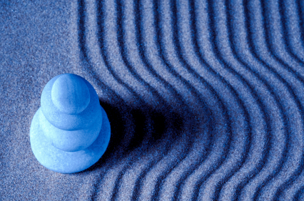
The element of pattern is the visual quality created by a combination of lines, forms, colors, textures, and spaces in the design. This photo has a wavy pattern. It is a more serene pattern, as it has cool colors and curved lines. If this photo was instead red with jagged lines, it would still be a pattern, although it would have an entirely different feel to it.
Element of Design- Light
Element of Design- Texture
The texture of something is the feel of the surface of the object. In this photo of tree bark, the texture is rough. You can see the ridges of the bark and can imagine how it would feel to touch it. Just from the photo you can see that the tree bark is rough, you don't even need to actually have felt the tree before. The texture is emphasized by the lighting of the photo, by adding depth.
Friday, August 31, 2012
Element of Design- Form
Although many examples of the element Form are black and white, this particular photo has a little bit of color. Granted, it isn't very exciting color, but that's not the point. The lighting coming from the left side of the photo gives the object depth. The lighting makes the shapes of this object stand out much more than they would without the uneven lighting.
Element of Design- Shape
This photo represents shape pretty well, in my opinion. When I first saw this photo, I saw the circle shape made by the wood of the colored pencils. After looking at it for a while, I began to see a sort of star shape in the middle. The star is an example of negative space. The circle would be positive space, because there are actually object there making the shape.
Element of Design- Line
To me, this photo seemed like a good choice for the Line element because of the five prominent curved lines. This photo, due to the curved lines, seems like it is a very serene building. The street on which this photo was taken may very well be busy, loud, and chaotic, but the way this was taken, the building seems calm. Also, the colors are beautiful.
Subscribe to:
Posts (Atom)