Thursday, September 27, 2012

 This project was pretty fun to do! It was much more simple than I'd imagined it to be. I'm happy with how my sign turned out!

Monday, September 24, 2012

Pen Tool!

Okay, the pen tool is really complicated, and sort of difficult to use. I'm glad I know how to use it though!

Friday, September 21, 2012


I chose this quote mainly because I love Tom Hiddleston. The words I chose to emphasize were the most important words or phrases in the quote. I chose the purple background because it symbolizes wisdom. Wisdom seemed to fit with this quote.

Thursday, September 20, 2012

Glyph Monster


  This project took me so long to finish! Even with working on it at home for a bit thse past few nights, it just took me forever!I think the amount of work I put into my little Dalek (from Doctor Who, for those Non-Whovians) really paid off! I'm very happy with how it turned out.


Wednesday, September 12, 2012

Quote with Color

       I decided I wanted to use this raspberry color because it is the color I associate with curtains on a stage or in a movie house, and the quote is about films, so I feel as though the color fits. I chose to put these words in color because they are the words I wanted to stand out the most. To me, they are the most important words in the quote.

Typography

   For this quote typography assignment, I read the quote and it made me think of a film that basically shaped my life. Of course, that would be the Harry Potter movies! I tried to arrange the words into the shape of a lightning bolt to represent the movies, and it sort of worked. I think the hardest part of this assignment was trying to make everything easy to read.

Wednesday, September 5, 2012


For the getting to know Illustrator assignment, I made a little ninja, a ball, and also made that strange thing in the middle. Not sure what it is, I'll leave that up to the imagination! I know bits and pieces of Illustrator, and I really enjoy working on it, so this was a fun assignment!

Monday, September 3, 2012

Element of Design- Color
When looking for something to put for color, this photo jumped out at me. It has such an interesting variety of colors, and they all work together beautifully. It looks as though there are three warm colors, then they change into cooler colors, then back to warm and back to cool. Also, where the bottles overlap created a different color blend and to me, it looks gorgeous. 
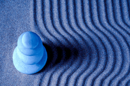
Element of Design- Pattern
 
The element of pattern is the visual quality created by a combination of lines, forms, colors, textures, and spaces in the design. This photo has a wavy pattern. It is a more serene pattern, as it has cool colors and curved lines. If this photo was instead red with jagged lines, it would still be a pattern, although it would have an entirely different feel to it.

Element of Design- Light
 
The element of light shows us three things. It affects color, shadows, and the visibility of a design. Without the light in this photo, it would be a lot more difficult to see, for many reasons. Without light in general, there would be no visibility and we wouldn't be able to see anything. Also, without the light that gives us color, we wouldn't be able to distinguish as well between certain things such as the flowers. The light in this photo is mostly artificial.
Element of Design- Texture
 
The texture of something is the feel of the surface of the object. In this photo of  tree bark, the texture is rough. You can see the ridges of the bark and can imagine how it would feel to touch it. Just from the photo you can see that the tree bark is rough, you don't even need to actually have felt the tree before. The texture is emphasized by the lighting of the photo, by adding depth.